Showing posts with label inclusive design. Show all posts

Tuesday, May 9, 2023

I Guess Nothing Lasts Forever: TESTHEAD At Large

I've recently found myself in an interesting position - after working for the same company for the past decade, I'm now looking for a new job. To be clear, this isn't entirely by choice. However, I have no ill will or hard feelings for the company that has chosen to put me at liberty. They are making choices that make sense for them and I've been here before.  Granted, it's been twenty years since I had to deal with this in such a stark way but this brings me to a realization. For the first time in a decade, I am free to explore and consider whatever career I want. I am literally unsupervised. To borrow from the old joke, yeah, it freaks me out a little bit, too, but the possibilities are endless.

My Motto for today. BTW, this shirt with this motto is available at:
https://www.etsy.com/listing/671632845/i-am-currently-unsupervised-i-know-it


I remember talking many times with people and they asked me if I had the chance and the choice to go into exactly the line of work and the area that I wanted to, what would it be? For anyone who has followed this blog for any length of time, that might seem obvious.

I would like to actively explore and advocate for better accessibility and Inclusive Design, whether that be in the digital or the physical world.

What is interesting to me is the fact that when I started working with my previous company, accessibility was the first major project I was responsible for and worked towards. It developed in me a desire for advocacy and speaking about the topic for the better part of a decade. However, due to shifting needs, I haven't worked with a hands-on active work project around accessibility since 2018. I miss being actively engaged with this at a level beyond speaking about and writing about it. 

Over the years, I've seen firsthand how important it is to design and build software that is accessible to everyone, regardless of their abilities. I've come to realize that accessibility isn't just something that's nice to have - it's a fundamental aspect of good design. It's good business and frankly, it's something every one of us will have to come to grips with at some point in some capacity.

Thuis to that end, I have decided to come back to my old friend, TESTHEAD, and recommit to sharing accessibility ideas, approaches, methodologies, and hey, maybe dive deeper into some programming aspects and ways to make accessibility tools that myself and others might want to use.

I'm excited to explore new opportunities, and if a good one comes along that's not specifically focused on accessibility, I'll certainly not dismiss it. However, this is a chance to put that very specific feeler out there, to see if someone out there would be interested in a passionate accessibility advocate and having them join their team or even working peripherally with them. Regardless, this blog has been quiet for too long outside of live blogging of conferences. I hope you will join me in my journey to change that. 

Wednesday, October 13, 2021

The Do's and Don'ts of Accessibility with @mkltesthead (#PNSQC2021 Follow Up Blog)


First of all, I wanted to say thank you to everyone that helped put on the Pacific Northwest Software Quality Conference (PNSQC). It's actually still happening but I have a policy of not covering the Workshop Day as that is an add-on expense and those who paid to participate deserve to have that experience for themselves. I'm looking forward to participating in those workshops today but again, I will not be liveblogging those sessions.

I also wanted to say thank you to the attendees of PNSQC and especially the attendees of my session, as your reviews and votes made it possible for me to be considered one of the three best presentations of the entire conference (specifically, the third best, so I can say my talk took Bronze :) ).  Considering there were 50+ presentations, that's a high honor and your survey comments and votes are what put me in that top three. Seriously, thank you, that made my day yesterday.

So what was my talk about? Here's a blurb from the site and links to the talk itself, plus my interpretive take, albeit this interpretation is a little slanted by comparison (I mean, I'm interpreting ME after all ;) ).

Accessibility is a large topic and one that often gets a variety of approaches to deal with. Often it is seen as having to focus on a large checklist (the WCAG standard) and making sure that everything complies. While this is a great goal and focus, often it is overwhelming and frustrating, putting people in the unfortunate role of having to read and understand an entire process before they feel they can be effective.

My goal is to help condense this a little and give some key areas to focus on and be effective in identifying Accessibility issues quickly and helping testers become effective advocates. 

We will look at ways to find issues, advocate for them and help make strides to greater understanding and focus moving forward. We can use a little to provide a lot of benefits.


Here's the link to my Technical Paper

Here's the link to my Presentation


Ultimately, the key takeaway I aimed to impress on the participants was that WCAG, Section 508, and other technical checklists are important to understand. Tools like WebAim, Axe, Lighthouse, Funkify, and other Accessibility checkers/tools are important to understand. Having said that, my talk spent almost no time talking about the checklists or tools. Instead, I asked the participants to take some time to become aware of the variety of disabilities that people deal with (both primary and situational) and focus on being advocates for those individuals. If we live long enough, every one of us will deal with a primary disability of some kind.

Disabilities fall into various spheres (cognitive, mobility, visual, auditory) and even if we do not have a chronic/primary disability, we can find ourselves in situations that render us effectively disabled. If in those situational conditions, we find the products that we work with to be hard to use, imagine how hard/frustrating it is for those with chronic/primary disabilities. 


This talk mainly focused on the mindset of the tester and asked for testers to step up and be advocates. The earlier we address Accessibility in the development cycle, the easier it is for us to implement, make it actionable, testable, and provide services that will work effectively for the largest number of users, whether they need assistive technology or not. 

Monday, October 12, 2020

PNSQC 2020 Live Blog: Human Centric User Acceptance Testing with Rebecca Long @Amaya30


The next couple of talk are set as quick briefs, so there are two speakers in  an hour-long block Rebecca Long is the first speaker and focusing on  User Acceptance Testing (UAT). What is the primary focus of UAT and more to the point, what does Human-Centric UAT look like? 


For starters, there are ways to be inclusive in the way that we look at our users. Our users are all individuals that have specific needs and ways to be addressed and validated. In addition to focusing on the product being a tool for users to access and interact with, we need to consider what ways we might be inadvertently making those users uncomfortable or put off. In today's world of immediate downloads and use, if we alienate our customers, unless they are locked into/forced to use an application, they will just as likely remove it and never let you know why.


As I tend to focus on Accessibility issues, this is certainly an area where we want to consider this level of focus in our UAT efforts. Above and beyond this are also ways that people wish to refer to themselves and identify. Being inclusive allows for a minimum of friction or complete lack of friction if possible. By taking the time to look at these areas we will help to encourage as many people as possible to use our products and actively engage with us.

Additionally, it's important to realize that these efforts are not one size fits all nor are they one and done efforts. People are complicated and they can be difficult to manage and interact with. Making the effort to include as many people as possible will help make a baseline that includes as many as possible and thus will be usable by as many as possible

Wednesday, April 3, 2019

Don't Make Yourself Obsolete: an #STPCon Quasi Live Blog Entry


Design Inclusively: Future Proof Your Software

Since it will be impossible to have me post on my own talk, I'm going to give a pre-recorded recollection and thoughts about my talk and what I'm hoping to impart with it.

Accessibility deals with the ability to design software so that it can work with technologies to help people with various disabilities use applications that they otherwise would not be able to use. 

Inclusive Design allows programmers to create and design websites and applications that are available to the largest population possible without having to rely on external technology necessary for sites to be Accessible

Inclusive Design and Accessibility go hand in hand and are complementary endeavors but Inclusive Design, done early, can help make the last mile of Accessibility that much easier. That's the key takeaway I want to convince people to consider and advocate for. 

Inclusive Design is not magic. In many cases, it’s taking work that has already been done and making some small but significant changes. New web technologies help to make Inclusive Design more effective by utilizing semantic enhancements. More important, making this shift can also help you make better design choices in the future, without having to bolt on or re-architect your existing code, possibly at great cost in time, energy and finances. Sadly, we are still in a model where Accessibility/Inclusive Design is driven by two specific parameters:

- how much money do we stand to gain from doing this (because big deal pending and customer paying is demanding it)
- how much money do we stand to lose from not doing this (because we're actually being sued for being in violation of various disabilities acts)

Fact is, we can't really say what technology will be like in five, ten, or twenty years. We can, however, with great certainty, understand what we are likely to be like in those same time frames. When I talk about future proofing software. I don't mean from a technological factor, I mean in a usage factor. We're not future proofing for machines. We are future proofing for US! At some point, every one of us will leave the happy sphere of what is commonly called "normative". For some, it's never been a reality. For many, the cracks in that sphere start to appear around age 45. Seriously, I didn't care much about Accessibility or think much about it before I turned 45 and received the gift that keeps on giving (i.e. the need for reading glasses). That was my first step into the non-normative world of adaptive needs and being a target audience for Accessibility as an everyday part of life. I can assure you it will not be my last.

There are a variety of things that can be done and truth be told they do not have to be radical changes. Very often people will look at Accessibility and Inclusive Design changes and they will say "hey, wait a minute, we applied all of these changes and I don't see any difference." Right! That's the whole point. Accessibility and Inclusive Design doesn't have to be ugly or inelegant. I'd argue that Accessible and Inclusive software is actually more beautiful because its form is enhanced by its function.

Oh, and for those who have never seen my presentation, without spoiling the surprise, I'll share a phrase out of context that speaks volumes:

"IKEA GETS IT!!!"

Thursday, March 28, 2019

Inclusive Meta Paradox Frameworks: A Little Shameless Self Promotion

I realize I'm terrible at promoting myself and the things that I'm doing. Having said that, I do want to encourage everyone to see what I'm up to and with that, I'm sharing a podcast I recorded with Mark Tomlinson for STPRadio.

Listen to "STPCON Spring 2019 Michael Larsen on Inclusive Meta Paradox Frameworks" on Spreaker.

You know the old saying "When the going gets weird, the weird turn pro?" Well, if you don't you do now :). Seriously, I love this title. Thank you, Mark, this is great.

Also, for those of you who are intimately familiar with my editing style on "The Testing Show", you may think that I am always smooth and flawless in my delivery, without any wasted breaths. Yep, it's true, no one on The Testing Show breathes... kidding, but now that I've planted that little seed in your head, I'll be the next time you listen to an episode you'll be subconsciously dwelling on that ;). My point is, Mark keeps it real and whatever was said as it was said is there in real time, so if you are curious as to how I really sound when I'm interviewed, here's your chance.

In this podcast, I talk about my workshop around "building a framework from scratch" (and yes after I finish this presentation I am going to start unpacking it and posting it here) as well as my talk on Accessibility and Inclusive Design and how they can be used to help Future Proof software.

If you will be at STPCon and you will be in my presentations, here's a taste of what to expect. If not, well, you get that anyway just by listening. Have fun and if you like the podcast, tell a friend about it, please.

Wednesday, April 11, 2018

STP-CON: A One-and-a-Half Handed #LiveBlog

Hello everyone! Greetings from Newport Beach, CA.

This session of the Testhead Live Blog will be a little different this year for a couple of reasons. The fundamental difference is that I am down the significant use of one arm. I had elbow surgery a couple of weeks ago (lateral epicondylitis for those who like specifics). It involved using ultrasound to pulverize a bone spur, perforate a tendon in my elbow so it looks like a slice of Havarti cheese and an insertion of blood serum from my other arm to give the tendon the optimal chance of healing. The net result is that I have a lovely wrist brace and elbow cuff that limits motion and makes typing with my left hand... less than optimal.

My loss is your (potential) gain. It means my trademark verbosity (I am a wordy fellow,. let's face it ;) ) will have to be diminished a bit. It also means I get to use some Accessibility features that I test for and advocate using. Some of these posts will be verbally generated, which should be... interesting.

I'd like to take the chance to first off say thank you to the attendees of my workshop yesterday. I taught a session on "Designing and Testing Inclusively" and it gave me a chance to expand on material and approaches that I usually get less than an hour to talk about or demonstrate. It also gave me an opportunity to explain why I chose the tools that I did, what the tradeoffs are for using them and an unexpected but nice detour. Towards the end of the session, we had a philosophical discussion about advocating for what can at times be conflicting suggestions. When does our advocacy for one goal mean that we are making someone else's experience diminish? Can we go too far? Additionally, how can we help people to care a little more about this?

Today is the first full day of the conference, and I will probably have to take a little more time to compose my thought than normal, so the rapid-fire multi-post process I'm known for may not happen this go around. Still, I'll do my best, so stay tuned :). 

Monday, March 5, 2018

Taking an AXe To It: Starting Accessibility Tooling (#CNC2018 #BLOGMORE)

I am rather far behind with my commitment to the #BlogMore challenge in the #CNC2018 campaign. Part of that is, of course, “life is what happens when you are busy making other plans” but more specifically I came to a conclusion that my original outlines were way too ambitious.

My topics as outlined were more suited for chapters for a possible book rather than single blog posts. Thus, I have decided to take something from each of the outlines and get very specific. Rather than do a vague post about Accessibility and Inclusive Design, I will focus on a specific tool that will allow me to address coding and design more directly.

There are numerous tools available that will allow programmers and testers to evaluate websites and applications for Accessibility and Inclusive Design. This post will be about just one of them. aXe is a tool developed by deque. It is open-source, free and runs inside of the browser along with a variety of Developer Tools. Currently, two versions are available (for Chrome and Firefox).

Adding an aXe to Your Arsenal


Installation is straightforward. Start by navigating to the download page for the extension (here’s the flow for Firefox):

1. Click on the Add to Firefox button.


2. Give aXe permission to be added as an extension.


3. After installation completes, this confirmation screen will appear.


4. Depending on how many add-ons you have, you will see something similar to the following on your Firefox browser toolbar.


5. Click on the aXe icon to get a help message. aXe is part of Developer Tools and appears within that context.


My preferred way to open Developer tools is to just click anywhere in the browser main window, right click, and then select “Inspect Element”.


If your installation went correctly, you should see the following. Click on the aXe navigation bar header to see the screen below. If you see this, you are good to go.


Press the “Analyze” button on your chosen web page. I might as well pick on myself. Let’s have a look at http://mkltesthead.com/.


See that output at the bottom? That’s an indication that I have some stuff to deal with.

I hear you saying, “well, OK, that’s… interesting… what exactly am I looking at here?”


A First Pass at your aXe Analysis
aXe gives the user a condensed listing of issues found. Let’s take a look at the listing in more detail:


The top section displays the number of Accessibility violations (in this case, 95 of them). The listing below the violations count is an area that says “Needs review”. These are potential violations, but they may not be. Let’s take a look at one of them:


We can see the issue. The validator cannot actually determine if the color contrast of the title is compliant. The reason is that there is an image beneath it, and that image has varying shades, where in some areas there is definitely a bold contrast, but in a few areas, the “whites of the Tachikoma’s eyes” are right next to the text. Below the issue description is the actual code that is being evaluated.

In this case, I have two choices. I can either tell the system that this is not an issue and move on, or I can consider how to match both the letter and spirit of the issue and fix it. Options are I could remove the image, or I could darken the image significantly so that all areas are in sharp contrast.

Additionally, I can do some sleuthing through the tool by clicking on the “Learn more” link next to the description. I can also click the “Inspector” link and see the element in context with the surrounding code for the page:


Clicking on “Highlight” will focus on the element in question but leave us with the review screen:


Having given the code a once-over, I can now (if I choose) make a decision for a course of action. In this case, I am going to make the executive decision to leave the image as it is and say that it is “not an issue” because, for 97% of the text, there is ample contrast.

By selecting “This is not an issue” and clicking the “Save” button, I update the aXe database and move on to the next issue that needs review.


If you followed along, that should give you some feel for how you can quickly use aXe to validate a number of Accessibility issues on your chosen page. There's plenty more where that came from, to say the least, and I will be getting into more details in future posts, both with aXe and a few other favorite Accessibility tools.

Tuesday, October 10, 2017

Off the Cuff Accessibility and Inclusive Design: #PNSQC Live Blog

And here I was wondering what I was going to say to give a highlight and wrap-up for my own talk that I gave yesterday.

The PNSQC Crew beat me to it. They asked me to give a video summary of my talk and some of my impressions of Accessibility and Inclusive Design.

This video chat was unrehearsed, so if you are used to my nice and polished podcasts, where I seem to speak super smooth and without flubs, today you get to see the real me: no edits, no do overs and a much more realistic representation of how I talk most of the time, hand flails and all.


To quote Ms. Yang Xiao Long... "So... that was a thing!"

Sunday, October 8, 2017

Evaluation and Testing: Accessibility for Everyone: Long Form Book Review

As seen in my last few entries, for the next undetermined number of posts, I will be reviewing Laura Kalbag's "Accessibility for Everyone". I have discussed with Laura my intention to do this, and she has given me her approval. This is going to be a review of the book and my own personal take on the concepts and ideas. I do not in any way intend for this to be a replacement for the book or otherwise want people to consider that reading my long form review basically means it's a Cliff Notes version of the book. I'm excited that books like this get written and I want to support Laura and other authors out there. If you think this book sounds intriguing, buy the book!!!

ACCESSIBILITY FOR EVERYONE

EVALUATION AND TESTING


Front cover of Laura Kalberg's book "Accessibility for Everyone"
Laura's main point of this chapter is that we can do all of the work, follow all of the guidelines, dot all of the 'i's and cross all the 't's and still fall well short of the intended goal if our implementation doesn't actually help our end users achieve their aims. Having been part of several Accessibility initiatives over the last five years I can attest that unanticipated things show up in testing or require the original hypothesis to be reconsidered.

That's great, so what is suggested? Well, for starters, make a plan. Whether that be a formal test plan or a series of conversations ons specific topics, the point is that there are a lot of criteria to be considered when looking at an Accessibility issue and creating a remedy for it. What approach will you use? How will you gauge progress? How will you document the testing progress? How will the testing results and recommendations be fed back into the development process? These are standard questions for any software tester, and how they are handled will vary between organizations, but they all go through this process in some manner if they wish to be successful.

One way to get a head start on looking at Accessibility issues is to become familiar with the WCAG standard. Different countries have their own standards, but WCAG is intended to be International, and as such will have a broad range of areas to look at. At times a local standard has some additional details that are relevant to that area, but usually looking at WCAG and meeting the requirements there will most of the time satisfy local requirements. The few that don't can be handled on a case by case basis.

The best test strategy is to literally use the product in the way that the intended customer will use it. If you need to rely on a screen reader, turn your screen off, or even better, find a dark room and do it so that you have limited ability to see the target machine. This is an example of persona testing taken to the next level, but I can attest to the fact that it is effective.

If you have the ability to participate in code reviews you have a chance to help shape the product at a fundamental level. Even if you don't, getting together with the programmers during the story workshop to discuss requirements can go a long way in helping to set up the necessary processes to ensure success. Also, a lot of the structural elements for Accessibility exist in the HTML and CSS, as well as other web technologies. That means that they can be looked at and confirmed to exist with automated tests. Still, don't be lulled into thinking you can automate all of the testings, as a lot of Accessibility comes down to the user experience. As of yet, that's proven to be a very tricky area to put automation into. For now, it still requires an empathetic human.

There are lots of tools available to the programmer and tester looking to validate their Accessibility work. Laura includes several that I would also consider excellent, such as:

W3C Markup Validation Tool
WebAim WAVE
Color Oracle

Laura has a much larger listing in the Resources section of the book.

KEY TAKEAWAY

The best way to test for Accessibility issues is to actively encourage and set up opportunities to test with people that actively use Accessibility software and devices. If that's not possible, then persona based testing is required and will have to stand in as the next best thing. There are lots of avenues and ways to test, lots of available tools, but ultimately it all comes down to one thing; can your intended audience of your product use it effectively? If there is a need for assistive technology, can that technology help provide a comparable experience for all of your users? If that sounds like a tall order, that's because it is. As I stated earlier, and as Laura also makes continuously through the book, we can work on Accessibility techniques but they don't amount to much if our users are frustrated in their goals. The best way to help ensure that doesn't happen is to test our implementations often.


Thursday, October 5, 2017

Content and Design: Accessibility for Everyone: Long Form Book Review

As seen in my last few entries, for the next undetermined number of posts, I will be reviewing Laura Kalbag's "Accessibility for Everyone". I have discussed with Laura my intention to do this, and she has given me her approval. This is going to be a review of the book and my own personal take on the concepts and ideas. I do not in any way intend for this to be a replacement for the book or otherwise want people to consider that reading my long form review basically means it's a Cliff Notes version of the book. I'm excited that books like this get written and I want to support Laura and other authors out there. If you think this book sounds intriguing, buy the book!!!

ACCESSIBILITY FOR EVERYONE

CONTENT AND DESIGN

Front cover of Laura Kalberg's book "Accessibility for Everyone"
Laura makes an interesting point in that all technology is assistive in some capacity. If we didn't have a keyboard, a mouse, a microphone, or speakers, how would we interact with the device? To that end, it helps to think of each aspect of how we interact and consider ways that we may be hindering the use of these basic tools. To borrow from the book directly here's a nice and succinct way to consider the four primary Accessibility domains:

1. Visual: make it easy to see.
2. Auditory: make it easy to hear.
3. Motor: make it easy to interact with.
4. Cognitive: make it easy to understand.

By contrast, if there is a limitation in one of these areas, we need to be aware of and prepared to make it possible to get the same (or similar) information into the other domains.

Sometimes people want to "shake things up" when it comes to design and approach. We might think it's silly to hold to "outmoded conventions" when it comes to icons and other things (I'm sure that there are many people who look at a Save icon who have never interacted with a floppy disk before). Still, the problem with that is that changing it to something new will potentially alienate and confuse those people who vividly remember what a floppy disk is and that it is nearly universally associated with "Save".

Methods of good accessible design are not that arcane, and many of them are already being implemented and you may not be aware of it. a navigation par that has descriptive listings can be a quick summary of a site's contents. It's tempting to pack sub-navigation bars and sub-sub-navigation bars in as a way to really economise and make information quickly available. For the mouse user, that may be true, but for a keyboard only user, sub-navs can be frustrating. Additionally, using mouse hovers to cause areas to pop out and be selected, again, is both non-intuitive and renders those not using a mouse unable to access the content unless an alternative method is provided. Using breadcrumbs or links to show where you have been previously can be helpful for those with cognitive disabilities as well as being just a nice thing to work with when you have to do several views in a hierarchy. Knowing where you are in that hierarchy shaves time and releases stress.

Links have had a long history on the web and their standard look and feel have helped make it easy for people to determine what tet makes a link, whether you have been there before, and something descriptive to tell you what the link represents. "Click Here" is a terrible linking convention. "Learn more about our services" works a lot better.

Writing for the web and for the greatest possible audience requires a balance. In my personal writing and anytime I try to write for my blog, I make a standard assumption that a sixth grader can read what I type. I don't always succeed, but that is the goal. To that end, breaking up paragraphs, using lists, bullet points, and other conventions to break up the flow is very helpful. Also, when possible, I encourage people to "speak Dude". If it's not possible to get a point across without technical jargon, that is understandable, but most of the time, we don't need to get overly flowery or "express overabundant facility via grandiose verbiage". That example is grammatically correct but bothersome to read.

Fonts can be rendered in a number of ways and it's important to realize that many font styles might look "cool" but could be painful to read. Using standard typesets and making the calling of the print easy for the user goes a long way in making the experience usable by as many people as possible.

Picture carousels, button increments and other cool uses of web "eye candy" can indeed show off your site and its features, but it can also be a chore to navigate through for users who are not able to use a mouse or view the pictures. Forms should allow for conventions that help make the process of filling them out as easy as possible, with prompts when something isn't correct, if possible, to be shown to alert an error before the users try to submit the form. Also, pages and content are able to change without the user doing anything on the page themselves. Dynamically updating copy is a reality, and making ways to alert users to that is important.

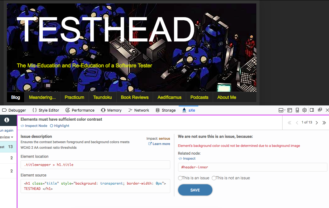
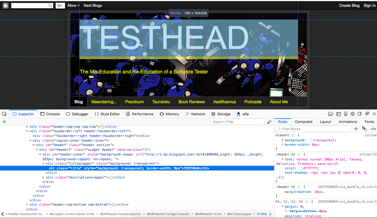
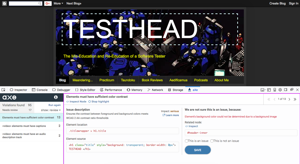
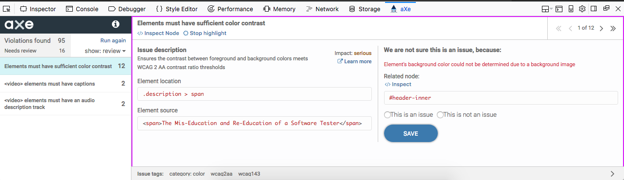
Color and color contrast can be a make or break for many people. Not enough contrast can mean it will be very difficult to see what is being displayed for some people. Higher contrast usually is better, but that may "clash" with your overall design aesthetic. Perhaps, but one can argue that your design is flawed if a sizeable population of your users can't even read the site. Also, color swatches by themselves without other identifying details like a text description can also lock users out of making relevant choices.

One of the longest standing and simplest to look for Accessibility issues is not using Alt text for a picture or an image that has significance to the page and the user's experience and reason for interacting with it. Icons such as Open, Save, Copy, Paste, if rendered as pictures, should absolutely have some other indicator of what that picture is. An Alt tag helps with that for those who cannot or choose not to display the pictures. A readable text description is also important, and the more descriptive. The better. "Picture of a girl next to a car" is OK. "Photograph of a woman standing next to a 1985 Alfa Romeo across from the Huntington Beach boardwalk" is even better.

Additional areas to consider are providing alternatives to content. Using the four domain examples, think about anything you are presenting and how that content may be locking people out. Consider alternative ways to provide that information. A video presentation? Provide closed captioning for hearing issues and a transcript for those with vision issues.

KEY TAKEAWAY

We often err on the side of what's easiest for us and we make decisions based on our normative experiences. Therefore, it's not surprising that a lot of design issues happen not because people are being deliberately callous but because they are trying to be expedient. To borrow from the old Larry Wall Perl maxim, we need to make sure "there's more than one way to do it" whenever possible. That's going to require some extra work, certainly, but the increased usability for more people will likely make up for that. Take some time to look at your site or app and think "what could be stopping people from interacting with this? How can I make it easier for them? How can I make it possible for the most people to benefit from my site or app?"

Tuesday, September 26, 2017

Accessibility for Everyone: A Long-Form, Multi Part Book Review

One of the things I find frustrating about technical books is that I often use them for a period of time, get an insight or two, go off and work on that insight for a while, and then I put the book down or look at something else until I'm in the mood for another insight, and the process repeats. Much of my technical library gets used this way. As such, I have hundreds of books that I have read part of, dozens I have read all the way through, very few that I have read cover to cover in a short period of time.

That makes it difficult to do timely reviews for certain books, so I decided I wanted to change that. Therefore, for the next undetermined number of posts, I will be reviewing Laura Kalbag's "Accessibility for Everyone". I have discussed with Laura my intention to do this, and she has given me her approval. Some may remember my chapter by chapter breakdown of Alan Page's book "How We Test Software at Microsoft" or Zed Shaw's "Learn Ruby The Hard Way". I'm planning on doing something similar this go around. However, this is going to be a review of the book and my own personal take on the concepts and ideas. I do not in any way intend for this to be a replacement for the book or otherwise want people to consider that reading my long form review basically means it's a Cliff Notes version of the book. I'm excited that books like this get written and I want to support Laura and other authors out there. If you think this book sounds intriguing, buy the book. It's officially available as of today :).

All right with that out of the way, let's get into it.

ACCESSIBILITY FOR EVERYONE


Book Cover for Laura Kalbag's book "Accessibility for Everyone"
Let's start with Heydon Pickering's Foreword. For those not Familiar with Heydon, he is the author of "Inclusive Design Patterns", another book that I want to do a proper review for as well. He points out that dealing with Accessibility is a step out of the comfort zone for many, and admittance that we have, at times, not been kind to some of our users and also to acknowledge that people use their technology and the Internet differently. By thinking and designing inclusively and considering Accessibility up front, we can better serve a more diverse group of people, and that is a worthy end goal in and of itself. I wholeheartedly agree.

CHAPTER ONE: CONSIDERING ACCESSIBILITY

Generally speaking, Accessibility and Inclusive Design don't fall into the lap of one person. There's no single arbiter that determines if a site is Accessible, and if you are part of an organization that is set up that way, let's just get this out of the way now... "you're doing it wrong" (btw, that's me injecting color commentary, Laura didn't say this specifically ;) ). Accessibility doesn't happen in a vacuum and it cannot be addressed separately from the rest of the development of your site or app.

Are there excuses to be made for why Accessibility is not something every organization considers from the outset or places great emphasis on? Absolutely. Some see it as boring, or the connection with the beneficiaries is hard to pin down. We're afraid we'll do it all wrong, and the most likely candidate for peak excuse is "it's too hard and there's too much to do". Laura hits every one of these out of the park. I'm intimately familiar with every one of these resistance statements and yes, all of them can be true, but we can also rise above them if we are so determined.

Ultimately, Accessibility is making a choice to include as many people as possible. For some, that will mean making specific modifications to communicate with assistive technology. Laura uses a simple example to drive the point home with doorknobs. Doors with round knobs are less accessible than doors that have levers that can be twisted. Laura makes the point that even her dog can open a lever handled door (though she frequently wishes that were not the case). A sliding door with a motorized movement and proximity detector to open would be the most accessible and would work for everyone, but may be impractical to implement everywhere. In this case, the lever knob is as inclusive as possible and as practical. It's definitely better than the round knob. Tones at signal crossings, closed captioning, simple and clear signs, and my personal favorite example that I love to hate, IKEA assembly instructions ;).

To successfully approach Accessibility, one of the best ways to put us into that mindset is to develop Empathy. It's easy to dismiss products that don't serve our needs when there's nothing preventing access to us. At that point, it's a matter of taste and aesthetics. However, it becomes a different issue when a product conspires to work against you because of dense text, dependence on mouse or touch controls, use of certain elements or not using them to deliberately or not deliberately but unknowingly locking people out of using them. The fact that I now have to wear readers has had a profound effect in the way that I interact with technology today.

The symbol of Web Accessibility today is the "screen reader". In fact, for many people, the screen reader is the start and finish of many Accessibility initiatives. If you mix Dragon Naturally Speaking into the mix, hey, you're off to the races. Alas, it's not that simple, and there's a lot of other issues related to Accessibility. Screen readers do however emphasize the fact that the mouse is effectively unusable, and that keyboard navigation is essential, and that is a big wake-up call to a lot of people when their mouse or trackpad isn't part of the workflow. See Empathy above ;).

KEY TAKEAWAY

Accessibility has a vocabulary all its own, and it can feel like there's a bit of an "in crowd" mentality to those not familiar with it. I admit to feeling the same way the first time I saw the #a11y hashtag and wondering what it meant. I was happy to be an ally, but then later learned that a11y was a way to say "Accessibility" in a shorter way ('a' with the number eleven between the 'y' because accessibility is 11 characters long). that's clever but it takes asking to understand what it means, and that's a bit of a metaphor for Accessibility in general. We want to make the web and apps accessible, yet sometimes getting into the "club" to understand Accessibility is harder than it needs to be. Laura is throwing down a gauntlet and saying that Accessibility needs to be something everyone on the development team has a stake in and takes part in, hence the book title, Accessibility for Everyone.


Monday, May 22, 2017

In a Manner of Speaking: 30 Days of Accessibility Testing


The Ministry of Testing has declared that May should be "30 Days of Accessibility Testing". As in the days of yore when I used to take on these challenges and blog regularly, I'm in the mood to get back to doing that. Therefore, I am looking to write a post every day around this topic and as a way to address each line of their checklist.

The song title puns continue, but this was a stretch. I know this one from Martin Gore, but it's a cover of a Tuxedomoon song. You're welcome ;).

22. Learn why semantic HTML is important.

Put simply, Semantic HTML goes beyond the literal markup of an HTML page and uses tags that have meaning in and of themselves.

To borrow from W3Schools explanation of semantic elements:

A semantic element clearly describes its meaning to both the browser and the developer.

Examples of non-semantic elements:  "div" and "span"  - Tells nothing about its content.
Examples of semantic elements: "form", "table", and "article" - Clearly defines its content.

Examples of Semantic HTML elements as seen on W3Schools site.
Examples of semantic HTML elements (W3Schools).

HTML 5 has taken this a step further by making it possible to structure documents by using more readily understandable terms. Tags such as "article", "aside", "details", "footer", "header", "nav", "progress",  "mark", and "time" all give clues as to what the element is meant to represent, much more quickly than a general "div" or "span" will tell you.

By using Semantic markup, we don't just make pages that are easier for users to understand, we make pages that are easier for developers to understand as well.

Tuesday, May 16, 2017

In Sharper Contrast: 30 Days of Accessibility Testing

The Ministry of Testing has declared that May should be "30 Days of Accessibility Testing". As in the days of yore when I used to take on these challenges and blog regularly, I'm in the mood to get back to doing that. Therefore, I am looking to write a post every day around this topic and as a way to address each line of their checklist.


I was away much of this past weekend, so I'm going to need to double up a couple of entries for a few days to catch back up. Thank you for your patience :).

15. Find a problem that might affect someone who is colourblind.

I have actually had a chance to interact with one of my scouts over the course of the past few years who is color-deficient and who has shown me several times how some sites are difficult for him to read because of the lack of contrast. His particular color-deficiency is called Protanomalia, so he has difficulty with seeing red or colors in the red spectrum, but it's not as pronounced a deficiency as Protanopia, which is a virtual loss of red perception. Still, even with a red deficiency, that often makes sites or apps that use red and that use colors that overlay the red as difficult to see. Thus, for me, the takeaway is that contrast is more desirable than aesthetic sense. 

I recently went back and looked at my blog and noticed that the gray to white contrast was not very strong, and after playing with my site in some color contrast tools, I decided to up the contrast and trade out orange elements for a brighter yellow hue. this matched wth white text on a dark gray background passes the first level of contrast, but I still have some issues regarding higher end contrast. 

Anyway, enough of my blathering. You probably wondered if I'd provide a resource that could help you look at color and color deficiency in a different way, right? Here's hoping I deliver on that promise. Visibone has a page dedicated to "Color Deficient Vision" and some examples to help you make choices regarding colors and color contrasts.


We're Not All Ears: 30 Days of Accessibility Testing

The Ministry of Testing has declared that May should be "30 Days of Accessibility Testing". As in the days of yore when I used to take on these challenges and blog regularly, I'm in the mood to get back to doing that. Therefore, I am looking to write a post every day around this topic and as a way to address each line of their checklist.


I was away much of this past weekend, so I'm going to need to double up a couple of entries for a few days to catch back up. Thank you for your patience :).

14. Find a problem that might affect someone who is deaf.

I've already addressed this somewhat with talking about how The Testing Show offers transcripts of our shows, but I wanted to think about this a bit deeper. I mean, that's great and all, but am I really looking at a big picture here? How else are we inadvertently not allowing those who are deaf to completely take advantage of the web and mobile apps?

In my poking around, I found "5 ways to make websites more accessible for deaf people", and in it, they list a few areas I really hadn't considered, i.e. they go outside of what I typically think about:

If your contact info doesn't have multiple options, or you just list a phone number, that's certainly going to be a problem for a deaf/hoh person. In this day and age, it may seem odd to not include an email, but many sites don't. The more options allowed that let people see and type in their inquiries, the more likely they will interact with you.

Subtitle/caption for videos: Seeing as I am currently creating a podcast that uses YouTube as a delivery mechanism, it's pretty nice to see the Closed Captioning option and how it works. It misspells my name, but I'm used to that ;). Other than that, that's a great plus, so if you want to use YouTube for video content, their CC option works well.

Using Simple English, or doing our best to make our message as clear and consistent as possible makes it possible for ASL communication to be less fragmented. Keeping it simple becomes even more important for people who may not consider English their first language (i.e. ASL would be).

Using Social Media channels to help communicate is a new one for me. I hadn't considered that using services like Facebook or Twitter, by the developed familiarity that people have with those platforms, can help amplify a message or a service by using the social platform paradigms.

Streamlining Navigation is a big plus for users who are blind or with low vision, but deaf/hoh users likewise benefit from a simple to navigate site. This is an example of Inclusive Design ideas coming into the discussion, where principles for one community can help make services more usable by everyone.

My thanks to Ellen Parfitt for the original post and some things to think about :).


Friday, May 12, 2017

Accessibility WTAmericas #WTBlitz Session: 30 Days of Accessibility Testing

This is not on the checklist, and in fact, this will be an additional part of the 30 days challenge. As I was working through the checklist, I realized that this would make for a great potential chat session for #WTBlitz, so that's what we will be doing for May.

Details:

On Wednesday, May 17, 207 at 1:00 p.m. Pacific (4:00 p.m. Eastern), we will hold a  one-hour #WTBlitz chat session on Twitter. We have asked Alicia Jarvis to join us as a special guest, and I have also asked additional Accessibility advocates if they would be willing to participate. To be part of it, just use the hashtag #WTBlitz and reply to the Questions posed directly to the threads.

Example, if I were to post:

Q1. Why is Accessibility important, and why should we test for it? #WTBlitz

we would like you to respond directly to the question thread with something like:

A1. [text of answer] #WTBlitz

This will allow us to keep the threads together and gather them for our experience reports and future referencing of answers.

These details will be duplicated on the Weekend Testing website, but I want to use here to get the ball rolling.

Why?

Because I want to see if we can get to what you all out there would find important, pertinent and interesting. To that end, I am going to start compiling a list of questions, and you can ask them/add them here. Likewise, I will encourage anyone who wants to tweet to me questions they would like to ask, and I will update and add the questions to the master list.

To get the ball rolling, here's a starting list of questions:

1. Why is Accessibility important, and why should we test for it?
2. Do you need to specialize in Accessibility to be effective?
3. Is WCAG the best standard to follow?
4. What tools are available to test for Accessibility?
5. If you had to recommend one tool to test Accessibility, what would it be?
6. Can you recommend good tutorial/reference material for Accessibility testing?
7. What is the difference between Accessibility and Inclusive Design?
8. How can I as a tester better advocate for Accessibility/Inclusive Design?

This is a list off the top of my head. They would seem to be natural questions to have a chat about to me, but again, I'm much more interested in what would be interesting to you. If this list is a good enough representation, then great, we'll go with it. If, however, you have better questions or ideas, then please, reply and leave them in the comments section. If the questions you ask are better than the ones listed here, I have no problem bumping these for better questions :).

Tuesday, May 9, 2017

Read All About It: 30 Days of Accessibility Testing

The Ministry of Testing has declared that May should be "30 Days of Accessibility Testing". As in the days of yore when I used to take on these challenges and blog regularly, I'm in the mood to get back to doing that. Therefore, I am looking to write a post every day around this topic and as a way to address each line of their checklist.

Still catching up from the weekend, so this is Day 8, but being posted on Day 9. Later today, I should be all caught up :).

8. Read a book about accessibility.

That's a tall order on any given day, and Accessibility is a big topic, so it's going to be a challenge to get through a book in one day, but it's definitely worthwhile and time well spent to get more familiar with the ideas and principles. With that, I have a few suggestions, and I've even written book reviews for a few of them.

The first book I strongly encourage everyone to read is  "A Web for Everyone: Designing Accessible User Experiences" by Sarah Horton and Whitney Quesenbery. Why do I suggest this one? Lots of reasons, but I really appreciate the depth and level of granularity they used to create personas for testing and relating to issues. This would be a remarkably good book to teach persona based testing as a separate discussion point, but the core of the book is to talk about Accessible user experiences and how to design and test for them. My long-form book review can be read here.

The second book I'd recommend is Katie Cunningham's "Accessibility Handbook: Making 508 Compliant Websites". It's a quick read, but there's a lot to look at and consider. As I stated in my Bottom line for this title "...coming in at 98 pages total, 80 pages of specific content, but don’t let its size fool you. This book will pay for itself with the first usability issues you find.  As you get better, you will be tempted to start creating unique personas for each of the areas, and by all means, do so. The process of seeing how solutions are presented, and how to make changes to those solutions, is well worth the purchase price." My long-form book review can be read here.

The third book I would recommend comes with a caveat, in that it is now ten years old, but don't let that prevent you from still learning a great deal in the process. "Design Accessible Web Sites: 36 Keys to Creating Content for All Audiences and Platforms" by Jeremy Sydik. at the core of this book is the Ten Principles of Web Accessibility, and these are the underpinning for the rest of the book. My long form review can be read here.

Inclusive Design Patterns Book CoverOK, yeah, that's great and all, but you've already read those. What are you going to do now, today? Good question, and unfortunately, it means this entry will be a little incomplete, but I have started reading "Inclusive Design Patterns: Coding Accessibility Into Web Design" by Heydon Pickering.

Of course, I will not be able to finish the entire book and do a review today, but I hereby commit to revisiting this and making a 31st-day entry so I can review the book properly.


Thursday, May 4, 2017

Everyone Deserves Inclusive Design: 30 Days of Accessibility Testing

The Ministry of Testing has declared that May should be "30 Days of Accessibility Testing". As in the days of yore when I used to take on these challenges and blog regularly, I'm in the mood to get back to doing that. Therefore, I am looking to write a post every day around this topic and as a way to address each line of their checklist.

Let's look at #4 on the list.

4. Research the benefits of inclusive design

This has been a personal crusade point of mine for the last couple of years. I've written several blog posts and given a few talks about the benefits of Inclusive Design. In short, Inclusive Design is "good design for everyone", or at least the largest number of people possible. 

Accessibility is making sure that information and online experiences are available to everyone, including using technology to bridge the gap where necessary (screen readers, closed captioning, speech recognition, etc.). 

Inclusive Design happens before these extra technologies are required. It can certainly leverage them and help make that "last mile" experience a good one, but the goal with Inclusive Design is to help design experiences that don't require special accommodations. When sites are optimizing for color blind users, yes, those optimizations do indeed help those who are color blind. It also helps make a site clearer and more defined for normative users, too. Making a site that has a consistent tab order and that follows standard keyboard conventions likewise helps all users. 

My favorite description of "What is Inclusive Design?" can be found as part of the Inclusive Design Toolkit, which is a series of articles and tools sponsored by the University of Cambridge.  

snapshot of the University of Cambridge Inclusive Design Toolkit homepage


I'm going to quote this section specifically, not so much as to the "what" but as to the "why":


"The majority of new product development projects focus on time and budget. However, this focus can conflict with delivering the most commercially successful product.
There is often the perception that design effort should be minimised in order to reduce cost and shorten timescales. In reality, the true costs of bad design (such as warranty returns from unsatisfied customers) emerge later on in the product life cycle, and have the potential to cause irreparable damage to the brand image through customer frustration."

For full context, see "Why do inclusive design?" and specifically, take a look at the section "the risk of bad design". It showcases an interesting one I hadn't considered until recently, U.S. Currency. since bank notes in the U.S. are all the same size, and until recently were all the same color, it was difficult for people with low vision to tell the bills apart. From the page:


"One costly example of insufficient accommodation of user diversity relates to the US Treasury. A court ruled that the Treasury discriminated against the blind and visually impaired by printing all denominations of currency in the same size and texture. Following this ruling, in 2011 the Treasury approved adding tactile features to US notes (Bureau of Engraving and Printing, 2011) at an estimated cost of $6.6 billion (ARINC, 2009). Subsequently, this proposal was changed to distributing free currency reader devices to eligible blind and visually impaired individuals, still at significant cost."


Additionally, to see me take a crack at discussing Inclusive Design in a recent talk, I presented "Making a Web for Everyone: Designing and Testing for Accessibility" at Agile Testing Days in Potsdam, Germany in November 2015. In it, I discuss several advantages of Inclusive Design, and what I felt at the time was a good example of it (i.e. the LoseIt! app as it appears on iPhone).

To close this out, the real win of Inclusive Design is the fact that we are proactively making considerations for the largest number of people to use our products effectively. Some may say that this will cost more, but I would argue that the costs of not using Inclusive Design principles may be much more expensive and longer lasting, as getting back reputation lost because of poor design may be impossible. These rules work in the world of toys, the garage, and the kitchen. They also work for software and the devices we have come to depend on. Let's make the most of it.


Friday, November 4, 2016

Adventures in Empathy - Simulating mild vision loss with the Cambridge Inclusive Design Toolkit

Last year, I spent a fair amount of my presentation time talking about ideas behind Inclusive Design, and how the both enhance and help contribute to performing Accessibility testing. One of the resources I suggested was the Inclusive Design Toolkit developed and used by the University of Cambridge. In addition to a wealth of information on their site, their methods go beyond software. Since they test numerous physical items, they do not rely on software tools only but have actual physical tools that you can use.

One of those is their Cambridge Simulator Gloves. These are rigid pieces of flexible plastic that can be adjusted to simulate a variety of physical issues with hands (e.g. rheumatism, arthritis). These are seriously cool pieces of kit, but they are pricey (£155 per pair, which is at this writing close to $200). Less expensive but also seriously cool are the Cambridge Simulation Glasses. These are considerably less expensive (£30 for a set of five glasses, which is less than $40 as of this writing), and therefore are easier for individuals looking to dabble in Inclusive Design to do so. The University of Cambridge is quick with orders and I received mine within a week of placing it. For shipments coming from the UK to the USA, really, that's pretty good.

Here's the single user Cambridge Simulation Glasses pack.


OK,  so what in the world is this?

The idea behind the simulation glasses is that you as an individual can experience progressive vision loss. Personally, I can already empathize because I have developed classic middle-aged person near-sightedness; I need readers to type this blog post, for example:
Not a fashion accessory, but also not a permanent fixture on my face (yet).
I do need them anytime I try to read or type anything.

If you are not already wearing prescription glasses, contacts, or need readers just yet, you may be wondering how you might be able to simulate mild vision loss. The simulation glasses do exactly that. Just put a pair on, and you will experience a little bit of fuzziness to your vision. If you want to intensify the effect, put on another pair of glasses over the top of the ones you are currently wearing. The kit comes with five pairs of glasses, and believe me, by the time you have put on all five, you will find it challenging trying to read much of anything.


If you wear glasses, you wear these over the tops of the ones you are wearing to give you a graduated simulation.

The loss of visual quality as you stack glasses.

The image above gives you an idea as to how fuzzy your vision gets with these, but it is even more jarring as you actually wear them. aAt the maximum level, you can really see how frustrating it is when you try to look at a screen or an object that has low contrast. Trying to determine what it is, much less how to use it, can be a real struggle. Again, there are software tools that simulate this, but there's something very interesting about being able to put on these graduated "fuzz" devices and try to do everyday tasks I take for granted.

For those who are interested in experiencing your apps, or your everyday products in a new way, and to develop a bit of empathy for your less visually normative friends (and those who live long enough will most likely get to join our ranks), then I do encourage getting these simulation glasses. They are worth the expense, and they do help reshape and reframe the way you see the world... or don't see it, in this case.