The Ministry of Testing has declared that May should be "30 Days of Accessibility Testing". As in the days of yore when I used to take on these challenges and blog regularly, I'm in the mood to get back to doing that. Therefore, I am looking to write a post every day around this topic and as a way to address each line of their checklist.
Day 10. Let's do this.
10. Test with a screen reader and share one useful tip.
Most of my day to day work the past few years has been done on a series of MacBook Pro devices. I use PCs in our test lab and I have an embarrassingly old Windows laptop that runs Windows 7 still for testing old stuff, but I use a Mac for 90% of my day to day stuff. Therefore, I utilize VoiceOver as my go to screen reader. My company uses JAWS as a commercial screen reader tool, and NVDA is a free screen reader for Windows. Since I'm dialed in for Mac at the moment, this tip is going to be about VoiceOver. At a later time, I will do some side by side comparisons of other screen readers for other platforms.
Apple has a pretty good tutorial/guide for using VoiceOver on their site, but I want to highlight a feature that I think is pretty helpful, and that's VO key locking. VO is a shorthand for the VoiceOver Modifier. By default, VO is the [control] and [option] keys pressed together. Thus, when you see reference to commands like "VO+h", that's simply "[control]+[option]+h". This command opens up the VoiceOver Help menu.
By typing "VO-;", you can lock the VO Modifier keys. This means that you can enter VoiceOver key commands without having to press the VO combination while it is turned on.
With the locking on, if I want to open the help menu again, now all I have to do is type "h".
By entering the same command, "VO-;" we can unlock the modifier.
It's a simple trick, and if you are used to the VO combinations, maybe not something you need, but I find it nice when I'm actively interacting with the screen reader to not have to use multiple key combinations each time.
BONUS TIP: This is a totally tangential use of VoiceOver, but you can use it as a "proofreader" for anything you type. We have a tendency to skip over our own typos, as well as grammatical lapses, but VoieOver will read through it with a steely resolve, and misspelled words jump out, as well as clunky grammar. Also, if you are curious as to whether or not you are using "semantic bleaching" with your writing, VoiceOver makes it painfully obvious, like superabundantly obvious ;).
Anyway, go forth, play with VoiceOver, have some fun with it. who knows you might find some interesting uses outside of its intended purpose.
Wednesday, May 10, 2017


Tuesday, May 9, 2017
Take Away the Pictures: 30 Days of Accessibility Testing
The Ministry of Testing has declared that May should be "30 Days of Accessibility Testing". As in the days of yore when I used to take on these challenges and blog regularly, I'm in the mood to get back to doing that. Therefore, I am looking to write a post every day around this topic and as a way to address each line of their checklist.
All right, post nine for Day 9. All caught up :).
9. Disable images in the browser. Can you understand the page?
Seems the only fair way to do this is to look at my own page again. I think it will be OK, but let's see if I'm good about my design choices:

Well, on the whole, that's not too bad. Notable things I "see":
There's no indication there's a graphic at the top of the page (my "Tachikoma Interrogation" image is just rendered as a black background. It's decorative, it's an inside joke to readers of my blog, but it's not an essential design element. Alt tag or something indicating what it is would be a plus, but its absence does not have any significant effect on the content of the page.
There are a number of little images that are normally represented as Edit boxes. Now they appear as squares with no content. For a viewer that would not be relevant, as they would not have permissions to edit the page, but if I were the owner and I wanted to make adjustments, the images don't tell me what they represent or why they might matter.
The LinkedIn button has alt text.
The Twitter app that I have embedded has no indication of the images that go with the tweets, but that's not all that important. I care more about the tweets being available and readable than whether or not the pictures are there. Besides, that's out of my control as I don't own the widget code (or do I? Need to look into that).
The On Facebook Widget has been rendered unrecognizable. Again, I don't have control over the widget to the best of my knowledge.
The On Google+ grid just shows a table of squares and no indication what the squares are.
The image showing the cover of Inclusive Design Patters book appears with a descriptive text.
The Social promotion tools are not accessible, they are missing.
Several other images that don't give any indication as to what they are.
Granted, that's just one post. I'm sure if I went far enough back in time I'd find a lot more, but just that one page gives an indication as to how many images creep into pages. Without a way to describe them, or alert individuals that they are decorative and don't add any semantic meaning to the site, it's hard to tell what they are or might represent. Looks like I have some template diving to do to see if I can do something about the number of blank images that appear. If I can't and the widgets are out of my control, then perhaps it's time to consider an alternative way to display that information.
All right, post nine for Day 9. All caught up :).
9. Disable images in the browser. Can you understand the page?
Seems the only fair way to do this is to look at my own page again. I think it will be OK, but let's see if I'm good about my design choices:

Well, on the whole, that's not too bad. Notable things I "see":
There's no indication there's a graphic at the top of the page (my "Tachikoma Interrogation" image is just rendered as a black background. It's decorative, it's an inside joke to readers of my blog, but it's not an essential design element. Alt tag or something indicating what it is would be a plus, but its absence does not have any significant effect on the content of the page.
There are a number of little images that are normally represented as Edit boxes. Now they appear as squares with no content. For a viewer that would not be relevant, as they would not have permissions to edit the page, but if I were the owner and I wanted to make adjustments, the images don't tell me what they represent or why they might matter.
The LinkedIn button has alt text.
The Twitter app that I have embedded has no indication of the images that go with the tweets, but that's not all that important. I care more about the tweets being available and readable than whether or not the pictures are there. Besides, that's out of my control as I don't own the widget code (or do I? Need to look into that).
The On Facebook Widget has been rendered unrecognizable. Again, I don't have control over the widget to the best of my knowledge.
The On Google+ grid just shows a table of squares and no indication what the squares are.
The image showing the cover of Inclusive Design Patters book appears with a descriptive text.
The Social promotion tools are not accessible, they are missing.
Several other images that don't give any indication as to what they are.
Granted, that's just one post. I'm sure if I went far enough back in time I'd find a lot more, but just that one page gives an indication as to how many images creep into pages. Without a way to describe them, or alert individuals that they are decorative and don't add any semantic meaning to the site, it's hard to tell what they are or might represent. Looks like I have some template diving to do to see if I can do something about the number of blank images that appear. If I can't and the widgets are out of my control, then perhaps it's time to consider an alternative way to display that information.
Read All About It: 30 Days of Accessibility Testing
The Ministry of Testing has declared that May should be "30 Days of Accessibility Testing". As in the days of yore when I used to take on these challenges and blog regularly, I'm in the mood to get back to doing that. Therefore, I am looking to write a post every day around this topic and as a way to address each line of their checklist.
Still catching up from the weekend, so this is Day 8, but being posted on Day 9. Later today, I should be all caught up :).
8. Read a book about accessibility.
That's a tall order on any given day, and Accessibility is a big topic, so it's going to be a challenge to get through a book in one day, but it's definitely worthwhile and time well spent to get more familiar with the ideas and principles. With that, I have a few suggestions, and I've even written book reviews for a few of them.
The first book I strongly encourage everyone to read is "A Web for Everyone: Designing Accessible User Experiences" by Sarah Horton and Whitney Quesenbery. Why do I suggest this one? Lots of reasons, but I really appreciate the depth and level of granularity they used to create personas for testing and relating to issues. This would be a remarkably good book to teach persona based testing as a separate discussion point, but the core of the book is to talk about Accessible user experiences and how to design and test for them. My long-form book review can be read here.
The second book I'd recommend is Katie Cunningham's "Accessibility Handbook: Making 508 Compliant Websites". It's a quick read, but there's a lot to look at and consider. As I stated in my Bottom line for this title "...coming in at 98 pages total, 80 pages of specific content, but don’t let its size fool you. This book will pay for itself with the first usability issues you find. As you get better, you will be tempted to start creating unique personas for each of the areas, and by all means, do so. The process of seeing how solutions are presented, and how to make changes to those solutions, is well worth the purchase price." My long-form book review can be read here.
The third book I would recommend comes with a caveat, in that it is now ten years old, but don't let that prevent you from still learning a great deal in the process. "Design Accessible Web Sites: 36 Keys to Creating Content for All Audiences and Platforms" by Jeremy Sydik. at the core of this book is the Ten Principles of Web Accessibility, and these are the underpinning for the rest of the book. My long form review can be read here.
 OK, yeah, that's great and all, but you've already read those. What are you going to do now, today? Good question, and unfortunately, it means this entry will be a little incomplete, but I have started reading "Inclusive Design Patterns: Coding Accessibility Into Web Design" by Heydon Pickering.
Of course, I will not be able to finish the entire book and do a review today, but I hereby commit to revisiting this and making a 31st-day entry so I can review the book properly.
Still catching up from the weekend, so this is Day 8, but being posted on Day 9. Later today, I should be all caught up :).
8. Read a book about accessibility.
That's a tall order on any given day, and Accessibility is a big topic, so it's going to be a challenge to get through a book in one day, but it's definitely worthwhile and time well spent to get more familiar with the ideas and principles. With that, I have a few suggestions, and I've even written book reviews for a few of them.
The first book I strongly encourage everyone to read is "A Web for Everyone: Designing Accessible User Experiences" by Sarah Horton and Whitney Quesenbery. Why do I suggest this one? Lots of reasons, but I really appreciate the depth and level of granularity they used to create personas for testing and relating to issues. This would be a remarkably good book to teach persona based testing as a separate discussion point, but the core of the book is to talk about Accessible user experiences and how to design and test for them. My long-form book review can be read here.
The second book I'd recommend is Katie Cunningham's "Accessibility Handbook: Making 508 Compliant Websites". It's a quick read, but there's a lot to look at and consider. As I stated in my Bottom line for this title "...coming in at 98 pages total, 80 pages of specific content, but don’t let its size fool you. This book will pay for itself with the first usability issues you find. As you get better, you will be tempted to start creating unique personas for each of the areas, and by all means, do so. The process of seeing how solutions are presented, and how to make changes to those solutions, is well worth the purchase price." My long-form book review can be read here.
The third book I would recommend comes with a caveat, in that it is now ten years old, but don't let that prevent you from still learning a great deal in the process. "Design Accessible Web Sites: 36 Keys to Creating Content for All Audiences and Platforms" by Jeremy Sydik. at the core of this book is the Ten Principles of Web Accessibility, and these are the underpinning for the rest of the book. My long form review can be read here.
 OK, yeah, that's great and all, but you've already read those. What are you going to do now, today? Good question, and unfortunately, it means this entry will be a little incomplete, but I have started reading "Inclusive Design Patterns: Coding Accessibility Into Web Design" by Heydon Pickering.
Of course, I will not be able to finish the entire book and do a review today, but I hereby commit to revisiting this and making a 31st-day entry so I can review the book properly.
Monday, May 8, 2017
The Keyboard Challenge: 30 Days of Accessibility Testing
The Ministry of Testing has declared that May should be "30 Days of Accessibility Testing". As in the days of yore when I used to take on these challenges and blog regularly, I'm in the mood to get back to doing that. Therefore, I am looking to write a post every day around this topic and as a way to address each line of their checklist.
This is my second entry for May 8, since I was away for the previous weekend. This brings me up to "day 7":
To tell the truth, this is one of the harder things to do on a computer in this current arc of evolution. Many sites are designed to use the mouse, and getting in and using the keyboard exclusively is challenging in many apps. I'm typing this entry with a minimal amount of mouse usage possible, trying my best to use just the keyboard to create and publish this post, as well as publicize it by launching a Tweet when I finish. That means that I have had to basically do away with many of the traditional modes of using the Blogger Editor. Many of the toolbar options are difficult to reach without using the mouse (there are keyboard analogs for several but not all of the options).
For consistency's sake, I found that it was easiest to just tab to the [Compose|HTML] toolbar and select HTML to do the active editing. It's a good approach if you remember your HTML formatting tags, but a lot of the workflows that I actively use don't find this to be a natural fit.
Tabbing over to get to the toolbars, I can enter the tags I want to use, but actually selecting the "Done" button requires tabbing through the entire tag list to get to the button. I'm sure there's a way to get to it quicker, but again, that requires me to dig into some knowledge base somewhere and learn exactly what that is. Frustrating? Believe it! Empathy building? Oh yes!!!
Tabbing to the Save button? Mission Accomplished. Preview? Successful. Umm, OK, how to get back to the editing tab? Umm... [alt]+[command]+[right arrow]... phew! OK, do I publish now? If so, the [Shift] key and seven tabs will get me to the publish button. Cool, now I'm on the Posts page. Select View... umm... tab over it and it disappears. How do I view it? Umm... dang it. Mouse over and click "View"... there it is. I admit I feel defeated at the moment. Still, a couple more tabs and I can highlight the Twitter icon at the bottom of the post. Hit Enter, type in some text, and tweet about this post. Done!
Well, That was quite a workout. It's also eye-opening to see just how much of what we do is optimized for point and click use, and how much additional knowledge and practice is required to be a keyboard ninja in many apps. Some standard keystrokes are familiar to everyone, and they tend to be standards that are adhered to, thankfully, but some more "obvious" operations are a bit more challenging to pull off. Needless to say, getting exhaustive with the keyboard goes well beyond this little blog post, but if the goal is to get the user to understand and empathize with how challenging it is to just use the keyboard to complete many workflows, it's abundantly clear to me at the moment that that is the case.
Now if you will all excuse me I'm going to go take a break. I'm tired ;).
This is my second entry for May 8, since I was away for the previous weekend. This brings me up to "day 7":
7. Unplug your mouse, leave the touchpad alone, and navigate using the keyboard.
To tell the truth, this is one of the harder things to do on a computer in this current arc of evolution. Many sites are designed to use the mouse, and getting in and using the keyboard exclusively is challenging in many apps. I'm typing this entry with a minimal amount of mouse usage possible, trying my best to use just the keyboard to create and publish this post, as well as publicize it by launching a Tweet when I finish. That means that I have had to basically do away with many of the traditional modes of using the Blogger Editor. Many of the toolbar options are difficult to reach without using the mouse (there are keyboard analogs for several but not all of the options).
For consistency's sake, I found that it was easiest to just tab to the [Compose|HTML] toolbar and select HTML to do the active editing. It's a good approach if you remember your HTML formatting tags, but a lot of the workflows that I actively use don't find this to be a natural fit.
Tabbing over to get to the toolbars, I can enter the tags I want to use, but actually selecting the "Done" button requires tabbing through the entire tag list to get to the button. I'm sure there's a way to get to it quicker, but again, that requires me to dig into some knowledge base somewhere and learn exactly what that is. Frustrating? Believe it! Empathy building? Oh yes!!!
Tabbing to the Save button? Mission Accomplished. Preview? Successful. Umm, OK, how to get back to the editing tab? Umm... [alt]+[command]+[right arrow]... phew! OK, do I publish now? If so, the [Shift] key and seven tabs will get me to the publish button. Cool, now I'm on the Posts page. Select View... umm... tab over it and it disappears. How do I view it? Umm... dang it. Mouse over and click "View"... there it is. I admit I feel defeated at the moment. Still, a couple more tabs and I can highlight the Twitter icon at the bottom of the post. Hit Enter, type in some text, and tweet about this post. Done!
Well, That was quite a workout. It's also eye-opening to see just how much of what we do is optimized for point and click use, and how much additional knowledge and practice is required to be a keyboard ninja in many apps. Some standard keystrokes are familiar to everyone, and they tend to be standards that are adhered to, thankfully, but some more "obvious" operations are a bit more challenging to pull off. Needless to say, getting exhaustive with the keyboard goes well beyond this little blog post, but if the goal is to get the user to understand and empathize with how challenging it is to just use the keyboard to complete many workflows, it's abundantly clear to me at the moment that that is the case.
Now if you will all excuse me I'm going to go take a break. I'm tired ;).
An Ode to Jason Becker: 30 Days of Accessibility Testing
The Ministry of Testing has declared that May should be "30 Days of Accessibility Testing". As in the days of yore when I used to take on these challenges and blog regularly, I'm in the mood to get back to doing that. Therefore, I am looking to write a post every day around this topic and as a way to address each line of their checklist.
I was away for the weekend and with limited Internet, so I have a couple of entries to do to get back up to date. Therefore there will be some doubled up entries. With that, here's #6:
I was away for the weekend and with limited Internet, so I have a couple of entries to do to get back up to date. Therefore there will be some doubled up entries. With that, here's #6:
6. Learn about assistive technologies, and share one you liked (hardware).
Whenever I hear about Assistive Technologies, I can't help but think of someone that was a contemporary of mine in the Bay Area music scene who, due to developing Amyotrophic Lateral Sclerosis (ALS), had his musical career and ascent cut short, but never stopped. That person is Jason Becker, an amazing guitarist that first came to my attention as part of a group called Cacophony. He grew up in the San Francisco East Bay area same as me, and we played in many of the same places. I saw him play several times in the mid to late 80s. I had the chance to talk with him just one time, briefly, after Cacophony played The Stone in San Francisco back in 1988. I was 20. He was 18. Shortly thereafter, he became David Lee Roth's guitar player and helped write his "A Little Ain't Enough" album with him.
That was when he was diagnosed with ALS.
Over time, his mobility would be greatly diminished, but his spirit and determination just would not quit.
Jason's Dad, Gary Becker, develop a system of communication called Vocal Eyes. Gary describes the process in this YouTube video:
Whenever I hear about Assistive Technologies, I can't help but think of someone that was a contemporary of mine in the Bay Area music scene who, due to developing Amyotrophic Lateral Sclerosis (ALS), had his musical career and ascent cut short, but never stopped. That person is Jason Becker, an amazing guitarist that first came to my attention as part of a group called Cacophony. He grew up in the San Francisco East Bay area same as me, and we played in many of the same places. I saw him play several times in the mid to late 80s. I had the chance to talk with him just one time, briefly, after Cacophony played The Stone in San Francisco back in 1988. I was 20. He was 18. Shortly thereafter, he became David Lee Roth's guitar player and helped write his "A Little Ain't Enough" album with him.
That was when he was diagnosed with ALS.
Over time, his mobility would be greatly diminished, but his spirit and determination just would not quit.
Jason's Dad, Gary Becker, develop a system of communication called Vocal Eyes. Gary describes the process in this YouTube video:
Basically, it's a board with a movement tracker that allows Jason to quickly spell out and create words to communicate with others. The eye tracking method lets him quickly put words together and, while not seamlessly communicate, it's actually quite fast and he's definitely proficient with it.
In many ways, Jason was the person that first inspired me to want to learn more about Accessibility, and Gary inspires me to always look for ways to keep moving forward when it may seem impossible to do so.
Jason still inspires me today, and thus, it gives me great pleasure to pay tribute to him as part of this Accessibility testing challenge.
If you'd like to know more about Jason and the absolute unwillingness he has shown to give in or give up and to do all he can to keep making music and communicating, I highly recommend seeing the documentary "Not Dead Yet". The trailer can be seen below:
Friday, May 5, 2017
Working with WCAG Guidelines: 30 Days of Accessibility Testing
The Ministry of Testing has declared that May should be "30 Days of Accessibility Testing". As in the days of yore when I used to take on these challenges and blog regularly, I'm in the mood to get back to doing that. Therefore, I am looking to write a post every day around this topic and as a way to address each line of their checklist.
With that, let's look at #5 today.
5. Read the 12 guidelines of WCAG 2.0. Write a short post on one of them.
5. Read the 12 guidelines of WCAG 2.0. Write a short post on one of them.
The Web Content Accessibility Guidelines (WCAG) is, as its name implies, a way to make sure that the content on the web is accessible. That means that it deals with ways that the information (text, pictures, sound) can be accessed as well as how that information is actually displayed in the markup and structure of pages.
A full breakdown of the WCAG principles can be seen here.
Principle 1 states:
Perceivable - Information and user interface components must be presentable to users in ways they can perceive.
Put simply, there needs to be a way for elements and information to be made available and accessible to users. One example of how I deal with this can be seen in "The Testing Show" podcast. One of the aspects we felt was important while we were developing the idea of the podcast was to be able to make the information in the podcast available to as many people as possible. We decided that making a transcript of the full podcast available would help us meet this principle. This was seen by us as a way to make the podcast available to users who could not hear it, as well as making it possible to review the information when listening to the podcast wasn't entirely practical.
This fits into Guideline 1.2 of WGAG 2.0, which is making alternatives available for time-based media. there are lots of other options, but this calls for a short post, and I'm sticking to the spirit of that request :).
Programming note: I will be away for the weekend, and not likely to have internet access, or at least not reliable access so I will need to double up on posts Monday. See you then :).
Thursday, May 4, 2017
Everyone Deserves Inclusive Design: 30 Days of Accessibility Testing
The Ministry of Testing has declared that May should be "30 Days of Accessibility Testing". As in the days of yore when I used to take on these challenges and blog regularly, I'm in the mood to get back to doing that. Therefore, I am looking to write a post every day around this topic and as a way to address each line of their checklist.
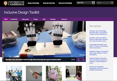
For full context, see "Why do inclusive design?" and specifically, take a look at the section "the risk of bad design". It showcases an interesting one I hadn't considered until recently, U.S. Currency. since bank notes in the U.S. are all the same size, and until recently were all the same color, it was difficult for people with low vision to tell the bills apart. From the page:
Let's look at #4 on the list.
4. Research the benefits of inclusive design
This has been a personal crusade point of mine for the last couple of years. I've written several blog posts and given a few talks about the benefits of Inclusive Design. In short, Inclusive Design is "good design for everyone", or at least the largest number of people possible.
Accessibility is making sure that information and online experiences are available to everyone, including using technology to bridge the gap where necessary (screen readers, closed captioning, speech recognition, etc.).
Inclusive Design happens before these extra technologies are required. It can certainly leverage them and help make that "last mile" experience a good one, but the goal with Inclusive Design is to help design experiences that don't require special accommodations. When sites are optimizing for color blind users, yes, those optimizations do indeed help those who are color blind. It also helps make a site clearer and more defined for normative users, too. Making a site that has a consistent tab order and that follows standard keyboard conventions likewise helps all users.
My favorite description of "What is Inclusive Design?" can be found as part of the Inclusive Design Toolkit, which is a series of articles and tools sponsored by the University of Cambridge.

I'm going to quote this section specifically, not so much as to the "what" but as to the "why":
"The majority of new product development projects focus on time and budget. However, this focus can conflict with delivering the most commercially successful product.
There is often the perception that design effort should be minimised in order to reduce cost and shorten timescales. In reality, the true costs of bad design (such as warranty returns from unsatisfied customers) emerge later on in the product life cycle, and have the potential to cause irreparable damage to the brand image through customer frustration."
"One costly example of insufficient accommodation of user diversity relates to the US Treasury. A court ruled that the Treasury discriminated against the blind and visually impaired by printing all denominations of currency in the same size and texture. Following this ruling, in 2011 the Treasury approved adding tactile features to US notes (Bureau of Engraving and Printing, 2011) at an estimated cost of $6.6 billion (ARINC, 2009). Subsequently, this proposal was changed to distributing free currency reader devices to eligible blind and visually impaired individuals, still at significant cost."
Additionally, to see me take a crack at discussing Inclusive Design in a recent talk, I presented "Making a Web for Everyone: Designing and Testing for Accessibility" at Agile Testing Days in Potsdam, Germany in November 2015. In it, I discuss several advantages of Inclusive Design, and what I felt at the time was a good example of it (i.e. the LoseIt! app as it appears on iPhone).
To close this out, the real win of Inclusive Design is the fact that we are proactively making considerations for the largest number of people to use our products effectively. Some may say that this will cost more, but I would argue that the costs of not using Inclusive Design principles may be much more expensive and longer lasting, as getting back reputation lost because of poor design may be impossible. These rules work in the world of toys, the garage, and the kitchen. They also work for software and the devices we have come to depend on. Let's make the most of it.
Wednesday, May 3, 2017
Give 'em the aXe: 30 Days of Accessibility Testing
The Ministry of Testing has declared that May should be "30 Days of Accessibility Testing". As in the days of yore when I used to take on these challenges and blog regularly, I'm in the mood to get back to doing that. Therefore, I am looking to write a post every day around this topic and as a way to address each line of their checklist.
Today, let's look at #3.
3. Share your favorite Accessibility tool.
I'm not sure if this counts as my favorite, but it's one I'm using quite a bit right now, and that's practically the same thing.
As I posted yesterday, WAVE is a popular Accessibility checking tool, but it looks at only one page at a time, and in a different window. When exploring Accessibility issues, I prefer to deal with the page right then and there, using something like Chrome Developer Tools or the other flavors of application out there that serve similar purposes.
If you use Chrome and like using Developer tools, then Deque Systems Chrome extension "aXe" may be right up your alley.
So let's see it in action. How about we repeat the test we did yesterday with WAVE on http://mkltesthead.com?

Today, let's look at #3.
3. Share your favorite Accessibility tool.
I'm not sure if this counts as my favorite, but it's one I'm using quite a bit right now, and that's practically the same thing.
As I posted yesterday, WAVE is a popular Accessibility checking tool, but it looks at only one page at a time, and in a different window. When exploring Accessibility issues, I prefer to deal with the page right then and there, using something like Chrome Developer Tools or the other flavors of application out there that serve similar purposes.
If you use Chrome and like using Developer tools, then Deque Systems Chrome extension "aXe" may be right up your alley.
So let's see it in action. How about we repeat the test we did yesterday with WAVE on http://mkltesthead.com?

We see that the error regarding image alt tags (several of them in fact) is still an issue, and we can highlight one of the images aXe is complaining about.
Great, so what can we do from here? We can test out a change using Developer Tools, and indeed a rescan shows that adding an alt tag drops our count of image tag issues. That change will only be good for that current session, but it does allow us to directly see the changes we apply and the effect they have. It also acts as a prompt for things we can directly modify for the image in Blogger, too. To do the latter, all you have to do is:
- Edit the page.
- Select the image.
- Click on "Properties".
- Fill in the title text and alt text as desired.
- Click Save.
If you display the page again and rescan, you'll see the count for images without alt tags drops by one.
So what was noteworthy about that? I could do it in the same window and then recheck it after the edit and see that it was updated. Of course, this is something that in a site where all of the files are local, you can just do a regex search and identify which images don't have alt tags. Blogger doesn't give me that option up front, so this is a nice way to check for Accessibility conformance, debug in the app view, and make changes as I go.
Not bad for a free app. Not bad at all :).
Tuesday, May 2, 2017
Wading into WAVE: 30 Days of Accessibility Testing
The Ministry of Testing has declared that May should be "30 Days of Accessibility Testing". As in the days of yore when I used to take on these challenges and blog regularly, I'm in the mood to get back to doing that. Therefore, I am looking to write a post every day around this topic and as a way to address each line of their checklist. Today, let's look at #2.
2. Use a tool like WAVE to scan a page for Accessibility problems.
Almost everyone that starts with Accessibility testing at some point early in their learning comes across WAVE. There are lots of good reasons why. First, it's a standalone page. Second, it's simple to get started. Just go to the site, put in the URL and Submit.
Ahh, but that's just the beginning :).


2. Use a tool like WAVE to scan a page for Accessibility problems.
Almost everyone that starts with Accessibility testing at some point early in their learning comes across WAVE. There are lots of good reasons why. First, it's a standalone page. Second, it's simple to get started. Just go to the site, put in the URL and Submit.
Ahh, but that's just the beginning :).

Let's try an experiment. How about we choose a page that's relevant to me? Heck, why not this blog? What would happen if I did a scan for http://mkltesthead.com/?
Looks like the answer is "there are a lot of issues" with my blog as it relates to Accessibility.

Let's start with the most obvious.
- It looks like most of the images being displayed do not have "alt" tags.
- The language of the page is not identified.
- Form elements are not labeled (the search bar is my guess)
- Lots of redundant links. This is a blog, so that may well be unavoidable, but it's still worth looking at. In this case, the redundant links are the tags I use for each post. Repetitive? Yes. Necessary? Arguably, yes.
- Contrast is low (I admit, I like the layout of my site, but it's a good bet that for color blind individuals it may well be hard to read).
I hear you all. You are thinking "OK, that's great, but so what?" Well, now I have a clearer idea of elements about my site design that I might want to change. Some I will have a hard time changing as they are part of the Blogger platform and templates, but many I can change since there are elements of the template that I can modify directly.
Redesigning my blog is not part of today's challenge, but just by doing this little bit, I'm seeing areas that I can directly control and changes I can personally make that can enhance or better the user's experience as Accessibility is concerned.
Updated: After I originally wrote this, I took a look at the contrast issues and determined where I could make a few changes. Just by picking a brighter yellow over a burnt orange for prominent text, and changing footer text from gray to white, I was able to eliminate 300+ contrast errors. Yay me :)!!!
Redesigning my blog is not part of today's challenge, but just by doing this little bit, I'm seeing areas that I can directly control and changes I can personally make that can enhance or better the user's experience as Accessibility is concerned.
Updated: After I originally wrote this, I took a look at the contrast issues and determined where I could make a few changes. Just by picking a brighter yellow over a burnt orange for prominent text, and changing footer text from gray to white, I was able to eliminate 300+ contrast errors. Yay me :)!!!
Curious to see how your site or other sites stack up? Go ahead, have a look. WAVE makes it easy :).
Making May 30 Days of Accessibility Testing
I love it when something comes my way that literally forces me to rethink and reconsider something I already care a lot about and like to believe I'm somewhat skilled in already. With thanks to the Ministry of Testing, I have decided that I will do all I can to get into the spirit and actively blog about their current challenge, 30 Days of Accessibility Testing.
If you follow the link above, there is a checklist, and that checklist just begs to be blogged about. Therefore I'm committing to doing exactly that. It's already May 2, so I'm a day behind. That means you'll be getting two posts from me today.
Let's start with entry 1.
1. Learn about the Diversity of Disabilities and the effects of aging.
I've written about this several times on this blog, but to keep with the spirit of the challenge, let's venture into something new. I came across "Defining Disability Diversity in Society" and I think it's worth a read.
The point of the original task is to consider the variety of disabilities, of which there are many.
I'm currently experiencing one example of a disability entirely related to my age. I'm no longer able to read anything comfortably without reading glasses. If I forget them, doing anything that requires me to read or type is compromised. At those times, I find myself looking at the options available in Accessibility tools. Not to test but just to cope with the situation.
I actually had this situation happen Sunday night. I went to a meeting for my daughter's upcoming camp counselor training, and I forgot my readers. I was next to useless when it came to reading anything close. Stuff that was written on the whiteboard I was OK with but that was across the room and large enough so I could see it clearly.
Truth be told, I didn't really think much about visual accessibility other than as a set of tools I'd need to know to test with until I turned 45. As a special birthday present, I was given a gift of near-sightedness (or where you struggle to see things close up, I always get the terms confused). In any event, that change in my daily reality took me from being an involved participant in Accessibility discussions to being committed to working on their behalf.
Chances are, you will have a similar opportunity to come to grips with this and other age-related ailments. Normativity is relative, and it's a moving target. At some point, all of us will fall outside of it and realize that we are part of a large community of "non-normative users" (there, that's a term for you just in case the term "disabled" bothers you).
Methinks this will be a very productive month :). Stay tuned.
If you follow the link above, there is a checklist, and that checklist just begs to be blogged about. Therefore I'm committing to doing exactly that. It's already May 2, so I'm a day behind. That means you'll be getting two posts from me today.
Let's start with entry 1.
1. Learn about the Diversity of Disabilities and the effects of aging.
I've written about this several times on this blog, but to keep with the spirit of the challenge, let's venture into something new. I came across "Defining Disability Diversity in Society" and I think it's worth a read.
The point of the original task is to consider the variety of disabilities, of which there are many.
- Visual disabilities ranging from mild to total blindness
- Auditory disabilities ranging from mild to total deafness
- Physical disabilities ranging from mild discomfort in joints to complete immobility or absence of limbs
- Cognitive disabilities that likewise run across a spectrum from mild to severe
- Learning disabilities
- Emotional disabilities
I'm currently experiencing one example of a disability entirely related to my age. I'm no longer able to read anything comfortably without reading glasses. If I forget them, doing anything that requires me to read or type is compromised. At those times, I find myself looking at the options available in Accessibility tools. Not to test but just to cope with the situation.
I actually had this situation happen Sunday night. I went to a meeting for my daughter's upcoming camp counselor training, and I forgot my readers. I was next to useless when it came to reading anything close. Stuff that was written on the whiteboard I was OK with but that was across the room and large enough so I could see it clearly.
Truth be told, I didn't really think much about visual accessibility other than as a set of tools I'd need to know to test with until I turned 45. As a special birthday present, I was given a gift of near-sightedness (or where you struggle to see things close up, I always get the terms confused). In any event, that change in my daily reality took me from being an involved participant in Accessibility discussions to being committed to working on their behalf.
Chances are, you will have a similar opportunity to come to grips with this and other age-related ailments. Normativity is relative, and it's a moving target. At some point, all of us will fall outside of it and realize that we are part of a large community of "non-normative users" (there, that's a term for you just in case the term "disabled" bothers you).
Methinks this will be a very productive month :). Stay tuned.
Subscribe to:
Posts (Atom)